![]()
Matplotlib Seaborn Tips Collection#
pandas経由でmatplotlibを使う方法や、matplotlibでのちょっとした小技、seabornで手軽に条件ごとのプロットを作るなど、知っているとよりきれいに、より素早くグラフが作れるtipsをまとめました。
基本的に章ごとに独立して実行できるようにしてあるので、目次から気になる項目だけ見ていっていただいても大丈夫です!
pandas.plot#
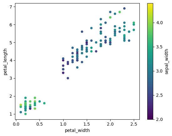
df.scatter:散布図#
df.plot.scatterで散布図を描画できます。cオプションで、値を色で表すこともできます
import pandas as pd
import matplotlib.pyplot as plt
import seaborn as sns

df = sns.load_dataset('iris') # サンプルデータフレーム
df.plot.scatter(x="petal_width",y="petal_length",c="sepal_width",colormap='viridis');
df.plot subplotsオプション:カラム毎サブプロット自動生成#
matplotlibで1から書くとやや面倒なsubplotsですが、pandasで簡単に作成できる場合もあります💡
多次元の時系列データを見るときに便利です。
公式リファレンスはこちらです。 https://pandas.pydata.org/docs/reference/api/pandas.DataFrame.plot.html
import pandas as pd
import plotly.express as px

df = pd.read_csv("https://github.com/plotly/plotly.py/raw/master/packages/python/plotly/plotly/package_data/datasets/stocks.csv.gz")
df = px.data.stocks()
df.head(5)
| date | GOOG | AAPL | AMZN | FB | NFLX | MSFT | |
|---|---|---|---|---|---|---|---|
| 0 | 2018-01-01 | 1.000000 | 1.000000 | 1.000000 | 1.000000 | 1.000000 | 1.000000 |
| 1 | 2018-01-08 | 1.018172 | 1.011943 | 1.061881 | 0.959968 | 1.053526 | 1.015988 |
| 2 | 2018-01-15 | 1.032008 | 1.019771 | 1.053240 | 0.970243 | 1.049860 | 1.020524 |
| 3 | 2018-01-22 | 1.066783 | 0.980057 | 1.140676 | 1.016858 | 1.307681 | 1.066561 |
| 4 | 2018-01-29 | 1.008773 | 0.917143 | 1.163374 | 1.018357 | 1.273537 | 1.040708 |
df.plot(x="date",subplots=True);
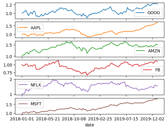
# df.plot(x="date",y=["GOOG","AAPL","AMZN","FB","NFLX","MSFT"],subplots=True); # yも指定可能
# df.set_index("date").plot(subplots=True); # デフォルトではx軸はindex
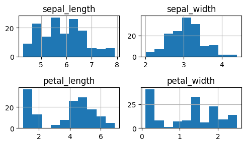
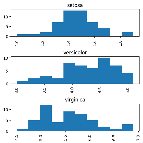
df.hist by,columnオプション:列の値ごとにサブプロット生成#
ヒストグラムを一気に作成できます💡
・オプションを何も指定しなかった場合、数値列はすべてプロットされます
・by, columnオプションを使用することで、byで指定した列の値ごとに、columnで指定した列をプロットできます
import pandas as pd
import matplotlib.pyplot as plt
df = pd.read_csv("https://raw.githubusercontent.com/mwaskom/seaborn-data/master/iris.csv")
df.head(5)
| sepal_length | sepal_width | petal_length | petal_width | species | |
|---|---|---|---|---|---|
| 0 | 5.1 | 3.5 | 1.4 | 0.2 | setosa |
| 1 | 4.9 | 3.0 | 1.4 | 0.2 | setosa |
| 2 | 4.7 | 3.2 | 1.3 | 0.2 | setosa |
| 3 | 4.6 | 3.1 | 1.5 | 0.2 | setosa |
| 4 | 5.0 | 3.6 | 1.4 | 0.2 | setosa |
df.hist(layout=(2,2),figsize=(5,3));
plt.tight_layout();
df.hist(by='species',column=["petal_length"],legend=False,layout=(3,1),figsize=(5,5));
plt.tight_layout();
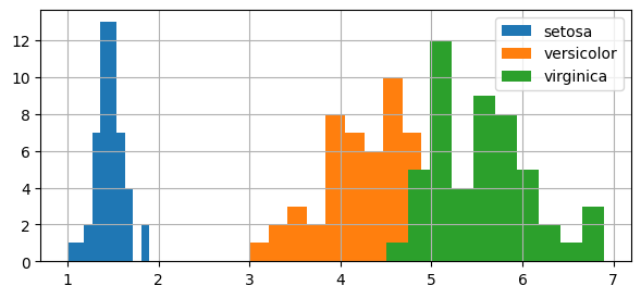
df.groupby.hist:列の値ごとに色を分けてプロット#
グループごとに手軽に分布を確認する方法を紹介します💡
df.groupby.histで、
グループごとに色分けしてヒストグラム表示できます。
https://pandas.pydata.org/docs/reference/api/pandas.core.groupby.DataFrameGroupBy.plot.html
https://pandas.pydata.org/docs/reference/api/pandas.core.groupby.DataFrameGroupBy.hist.html
# df.groupby("species").hist(legend=True, layout=(1,4),figsize=(16,2)); # 微妙
import pandas as pd
import matplotlib.pyplot as plt
import seaborn as sns
df = sns.load_dataset('iris') # サンプルデータ(pd.DataFrame)
df.groupby("species")["petal_length"].hist(legend=True, figsize=(7,3));
plotting_backend:プロットに使うライブラリを指定#
pandasのoption.plotting.backendで、 df.plot()の時に使う可視化ライブラリを指定することができます。 デフォルトはmatplotlibですが、例えばplotlyに変えることもできます
import pandas as pd
import matplotlib.pyplot as plt
import plotly.express as px

df = px.data.iris() # サンプルデータ
pd.options.plotting.backend = "plotly"
df.plot.scatter(x='sepal_width',y='sepal_length',color='species')
pd.options.plotting.backend="matplotlib"
matplotlib#
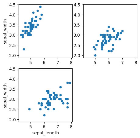
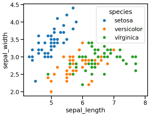
Axes.remove:余分なグラフ枠の削除#
subplots で作成した余分な Axes を remove() で簡単に除外できます! 中身のないグラフ枠を削除して、見やすいレイアウトに仕上げられます
import pandas as pd
import matplotlib.pyplot as plt
import seaborn as sns

df = sns.load_dataset('iris') # サンプルデータフレーム
# removeを使わない場合
rownum = 2
colnum = 2
fig,ax = plt.subplots(rownum,colnum,sharex=True,sharey=True,figsize=(5,5))
for i,s in enumerate(df.species.unique()):
    df[df["species"]==s].plot.scatter(x="sepal_length",y="sepal_width",ax=ax[int(i/colnum)][i%colnum])

plt.show()
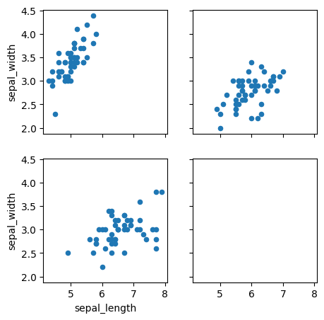
# removeを使った場合
rownum = 2
colnum = 2
fig,ax = plt.subplots(rownum,colnum,sharex=True,sharey=True,figsize=(5,5))
for i,s in enumerate(df.species.unique()):
    df[df["species"]==s].plot.scatter(x="sepal_length",y="sepal_width",ax=ax[int(i/colnum)][i%colnum])
ax[1][1].remove() # ブランクの除外
plt.show()

# 補足:add_subplotを使う場合。そもそも不要なグラフ枠は表示されない
fig = plt.figure(figsize=(5,5))
ax = None
for i,s in enumerate(df.species.unique()):
    ax = fig.add_subplot(2,2,i+1) if(not ax) else fig.add_subplot(2,2,i+1,sharex=ax,sharey=ax)
    df[df["species"]==s].plot(kind="scatter",x="sepal_length",y="sepal_width",ax=ax)
plt.show()
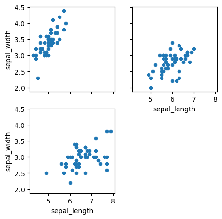
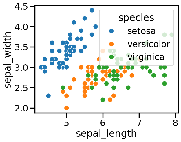
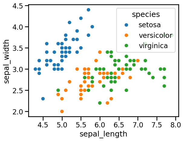
tick_params(labelleft=True):sharexを使ってもすべてのx軸を表示#
sharexやshareyをTrueにすると、外側のAxesにしか軸の値が表示されなくなります。しかし、tick_paramsでlabel_bottomやlabel_leftをTrueに設定することで、個別のAxesにも軸の値を表示させることが可能です。
import pandas as pd
import matplotlib.pyplot as plt
import seaborn as sns

df = sns.load_dataset('iris') # サンプルデータフレーム
# tick_paramsを設定しない場合
rownum = 2
colnum = 2
fig,ax = plt.subplots(rownum,colnum,sharex=True,sharey=True,figsize=(5,5)) # sharex,shareyをTrueにして、軸をそろえる
for i,s in enumerate(df.species.unique()):
    df[df["species"]==s].plot.scatter(x="sepal_length",y="sepal_width",ax=ax[int(i/colnum)][i%colnum])


ax[1][1].remove() # ブランクの除外
plt.show()
# # tick_paramsを設定した場合。すべての軸の値を表示させる
rownum = 2
colnum = 2
fig,ax = plt.subplots(rownum,colnum,sharex=True,sharey=True,figsize=(5,5))
for i,s in enumerate(df.species.unique()):
    df[df["species"]==s].plot.scatter(x="sepal_length",y="sepal_width",ax=ax[int(i/colnum)][i%colnum])
for i,s in enumerate(df.species.unique()):
    ax[int(i/colnum)][i%colnum].tick_params(labelleft=True,labelbottom=True) # x,y軸の表示
ax[1][1].remove() # ブランクの除外
plt.show()
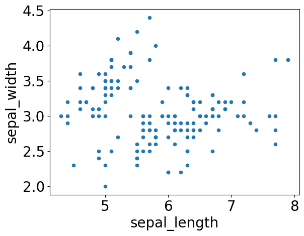
rcParams matplotlib:文字サイズなどのオプション設定#
rcParamsでmatplotlibで描くプロットの設定を変えることができます。 フォントサイズを常に大きくしておきたい場合など便利です💡
import seaborn as sns
df = sns.load_dataset('iris') # サンプルデータフレーム
import matplotlib as mpl
mpl.rcParams['font.size']=20

# ↓これでもOK
# import matplotlib.pyplot as plt
# plt.rcParams['font.size']=20
df.plot.scatter(x="sepal_length",y='sepal_width');
mpl.rcParams['font.size']=10
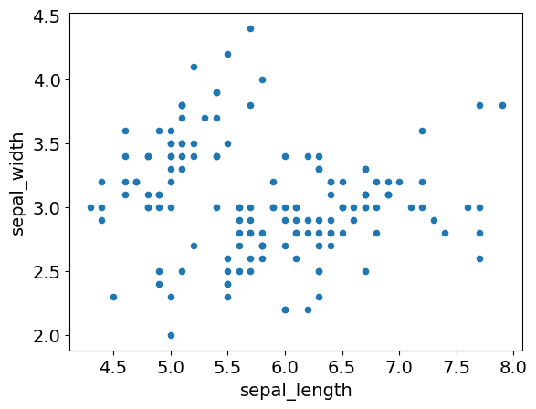
with句 rc_context.rc_context:一時的にプロットの設定を変える#
rc_contextで一時的にmatplotlibの設定を変更できます。 rcParamsを使ったやり方だと、以降のグラフすべてに設定が適用されますが、rc_cotextはwith文の中だけに適用されます
このグラフだけ文字大きくさせたい、みたいなときに便利です💡
https://matplotlib.org/stable/users/explain/customizing.html
import matplotlib.pyplot as plt
import seaborn as sns
df = sns.load_dataset('iris') # サンプルデータフレーム
with plt.rc_context({'font.size':14}):
  df.plot.scatter(x="sepal_length",y='sepal_width');
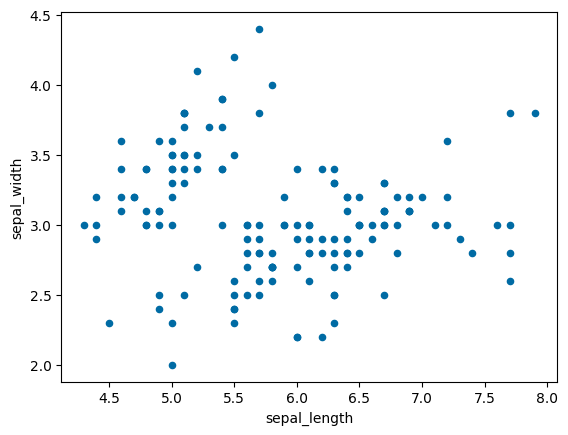
plt.style.use:スタイルの変更#
matplotlibは、plt. style.use()で、スタイルを変更できるみたいです。 seabornやtableauみたいなスタイルも用意されています。
公式ドキュメントにスタイル一覧が掲載されています https://matplotlib.org/stable/gallery/style_sheets/style_sheets_reference.html
import pandas as pd
import matplotlib.pyplot as plt
import seaborn as sns
df = sns.load_dataset('iris')
print(plt.style.available)
['Solarize_Light2', '_classic_test_patch', '_mpl-gallery', '_mpl-gallery-nogrid', 'bmh', 'classic', 'dark_background', 'fast', 'fivethirtyeight', 'ggplot', 'grayscale', 'petroff10', 'seaborn-v0_8', 'seaborn-v0_8-bright', 'seaborn-v0_8-colorblind', 'seaborn-v0_8-dark', 'seaborn-v0_8-dark-palette', 'seaborn-v0_8-darkgrid', 'seaborn-v0_8-deep', 'seaborn-v0_8-muted', 'seaborn-v0_8-notebook', 'seaborn-v0_8-paper', 'seaborn-v0_8-pastel', 'seaborn-v0_8-poster', 'seaborn-v0_8-talk', 'seaborn-v0_8-ticks', 'seaborn-v0_8-white', 'seaborn-v0_8-whitegrid', 'tableau-colorblind10']
# styleの変更
plt.style.use('tableau-colorblind10')
df.plot.scatter(x="sepal_length",y='sepal_width');
plt.style.use('default')
seaborn#
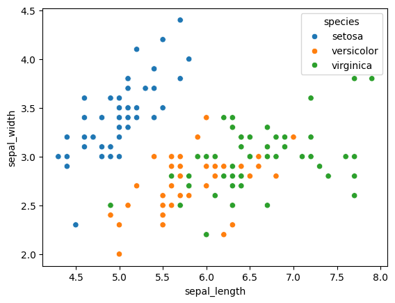
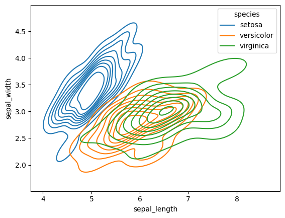
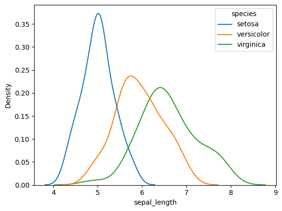
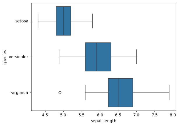
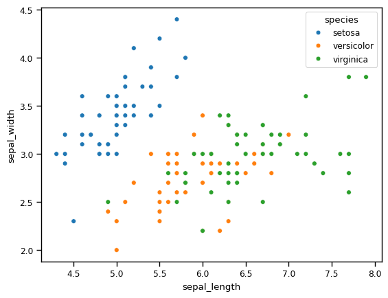
sns.scatter, kdeplot, histplot, boxplot, stripplot#
簡単&見栄え良く可視化できるseabornの紹介です💡
x:x軸の列を指定
y:y軸の列を指定
hue:色分けに使いたい列を指定
data:データフレーム
このオプションさえ覚えておけば、大抵のプロットは描けます!
import seaborn as sns
df = sns.load_dataset('iris') # サンプルデータフレーム
sns.scatterplot(x="sepal_length",y="sepal_width",hue="species",data=df);
sns.kdeplot(x="sepal_length",y="sepal_width",hue="species",data=df);
sns.kdeplot(x="sepal_length",hue="species",data=df);
sns.boxplot(x="sepal_length",y="species",data=df);
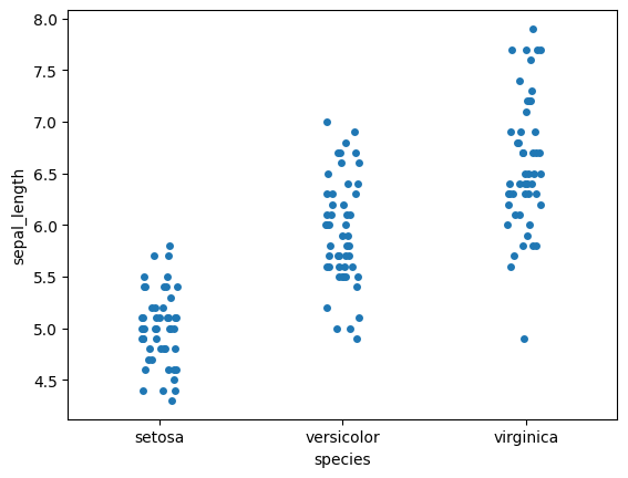
sns.stripplot(x="species",y="sepal_length",data=df);
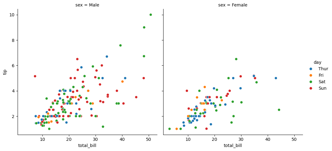
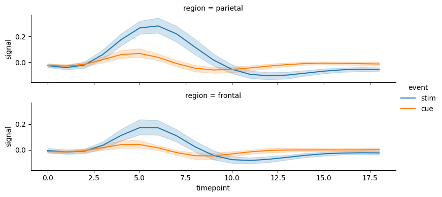
relplot:条件ごとグラフを分けて折れ線グラフや散布図を表示#
seabornのrelplotを使えば、row,colオプションで指定したカラムの値ごとに、散布図や折れ線グラフを描くことができます。
条件ごとにグラフを分けて見たい場合に便利です💡
import seaborn as sns
df = sns.load_dataset('tips') # サンプルデータフレーム
sns.relplot(data=df, x="total_bill", y="tip", hue="day", col='sex');
import seaborn as sns
df = sns.load_dataset("fmri")# サンプルデータフレーム
sns.relplot(
    data=df,
    kind="line", # line(折れ線グラフ) , scatter(散布図)が指定可能
    x="timepoint", y="signal", hue="event",
    row="region", # 縦方向に分けてみたいカラムを指定。同様にcolで横方向に分けてみたいカラムを指定可能
    height=2,aspect=4 # 表示サイズ
);
補足
FacetGridでも、条件ごとにサブプロットの作成が可能ですが、
relplotやcatplotを使うことが推奨されています。
https://seaborn.pydata.org/generated/seaborn.relplot.html
https://seaborn.pydata.org/generated/seaborn.scatterplot.html
Using relplot() is safer than using FacetGrid directly, as it ensures synchronization of the semantic mappings across facets.
https://seaborn.pydata.org/generated/seaborn.FacetGrid.html
When using seaborn functions that infer semantic mappings from a dataset, care must be taken to synchronize those mappings across facets (e.g., by defining the hue mapping with a palette dict or setting the data type of the variables to category). In most cases, it will be better to use a figure-level function (e.g. relplot() or catplot()) than to use FacetGrid directly.
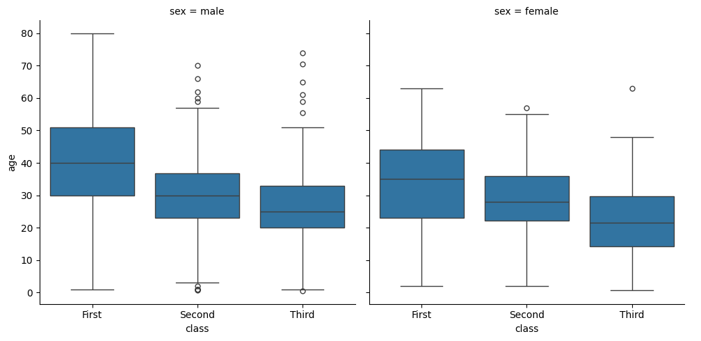
catplot:条件ごとにグラフを分けて箱ひげ図などを表示#
seabornのcatplotを使えば、連続値vsカテゴリ値のグラフをrow,colで指定したカラムのカテゴリ値ごとに生成できます。
連続値vs連続値の関係を見るrelplotとセットで覚えておくとよいと思います💡
https://seaborn.pydata.org/generated/seaborn.catplot.html
import seaborn as sns
df = sns.load_dataset("titanic") # サンプルデータ
sns.catplot(data=df, y="age", x="class",col='sex', kind="box");
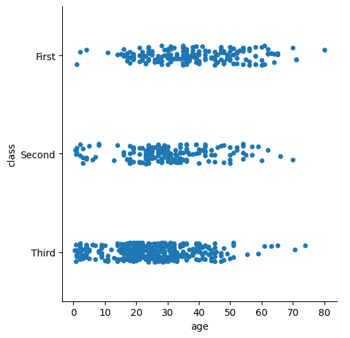
sns.catplot(data=df, x="age", y="class")
<seaborn.axisgrid.FacetGrid at 0x7f34c4879810>
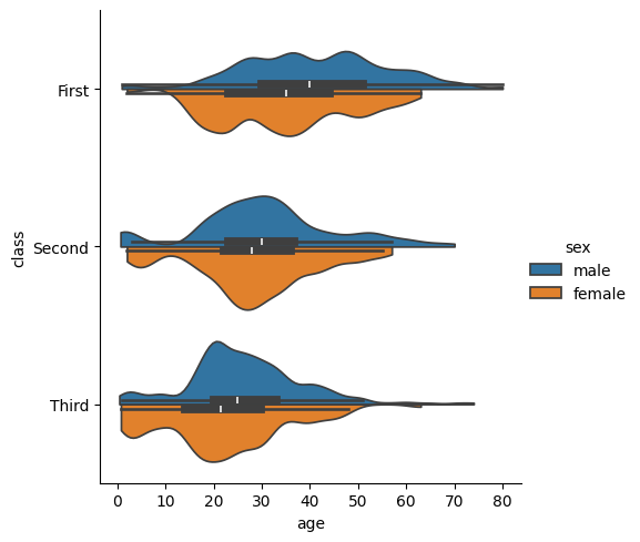
sns.catplot(
    data=df, x="age", y="class", hue="sex",
    kind="violin", bw_adjust=.5, cut=0, split=True,
)
<seaborn.axisgrid.FacetGrid at 0x7f347838e860>
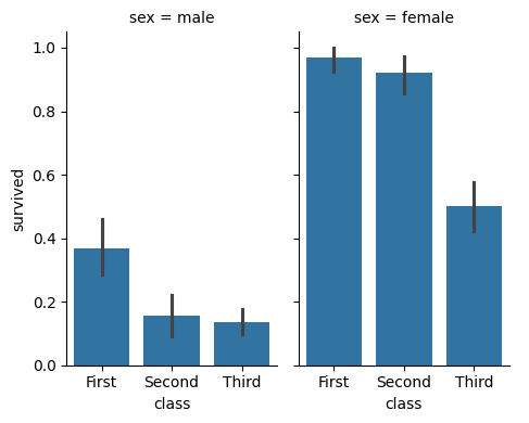
sns.catplot(
    data=df, x="class", y="survived", col="sex",
    kind="bar", height=4, aspect=.6,
);
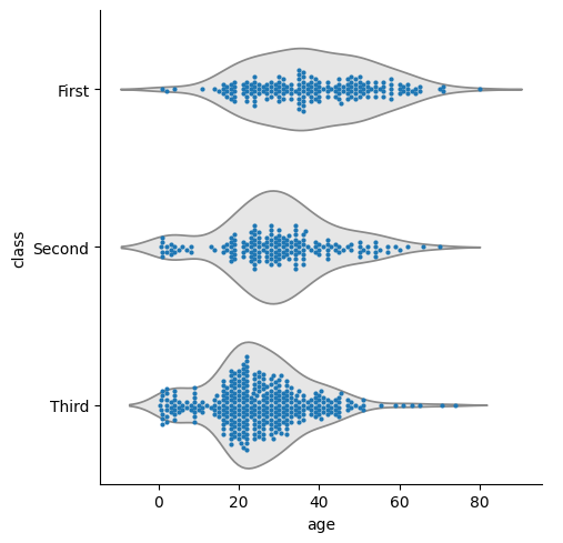
sns.catplot(data=df, x="age", y="class", kind="violin", color=".9", inner=None)
sns.swarmplot(data=df, x="age", y="class", size=3)
<Axes: xlabel='age', ylabel='class'>
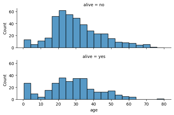
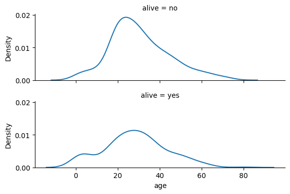
displot: 条件ごとにグラフを分けてヒストグラムなどを表示#
https://seaborn.pydata.org/generated/seaborn.displot.html
import seaborn as sns
df = sns.load_dataset("titanic") # サンプルデータ
sns.displot(data=df, x="age", row='alive', kind="hist", height=2, aspect=3);
sns.displot(data=df, x="age", row='alive', kind="kde", height=2, aspect=3);
sns.set_context:プロット全般の設定#
seabornのマーカーやフォントのサイズはまとめて変更できます。
sns.set_context(“poster”)
サイズは、 paper, notebook, talk, poster の4種類です!
パワポ用にプロットするときはtalkかposterに しておくと便利だと思います💡
import matplotlib.pyplot as plt
import seaborn as sns
df = sns.load_dataset('iris') # サンプルデータフレーム
c_list = ["paper", "notebook", "talk", "poster"]
for c in c_list:
  print(c)
  sns.set_context(c)
  sns.scatterplot(x="sepal_length",y="sepal_width",hue="species",data=df);
  plt.savefig(c+".png")
  plt.show()
paper
notebook
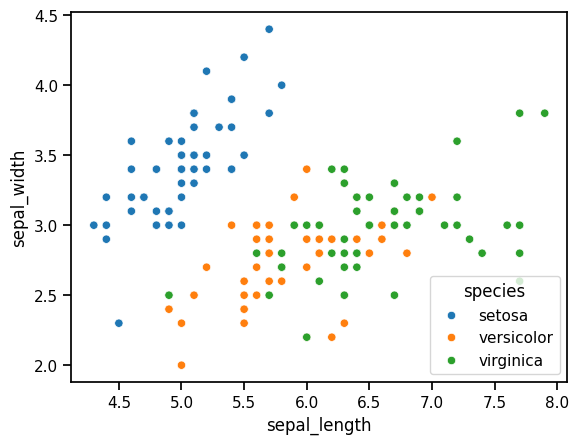
talk
poster
sns.reset_orig()# 元に戻す
with句 sns.plotting_context():一時的なプロット設定#
sns.set_context()メソッドでは、
以降描くプロットすべてにその設定が適用されますが、
with文とsns.plotting_context()メソッドで、
with文の中のプロットだけに設定を適用できます
このプロットだけ大きく表示させたい、という時に便利です!
https://seaborn.pydata.org/generated/seaborn.plotting_context.html
import matplotlib.pyplot as plt
import seaborn as sns
df = sns.load_dataset('iris') # サンプルデータフレーム
with sns.plotting_context("talk"):
  sns.scatterplot(x="sepal_length",y="sepal_width",hue="species",data=df);
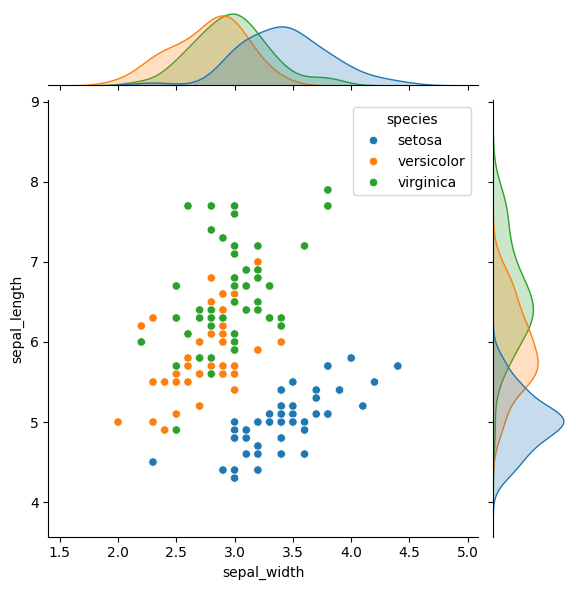
jointplot:散布図とヒストグラムなどをを同時に見られる#
seabornだと、jointplot関数で散布図+上と右にヒストグラム等を描けます💡
plotly.expressだと、scatter関数のmarginal_x,yオプションで同じようなことができます
https://seaborn.pydata.org/generated/seaborn.jointplot.html
import seaborn as sns
df = sns.load_dataset("iris") # サンプルデータ
sns.jointplot(data=df, x="sepal_width", y="sepal_length",hue="species");